

The Best UI/UX Practices for SaaS Products
Design isn’t just how something looks—it’s how it works. For SaaS (Software-as-a-Service) products, outstanding UI/UX design isn’t a luxury—it’s a necessity. Whether you’re crafting a project management tool, an invoicing platform, or a CRM system, great UI/UX can make or break your user experience. Let’s dive into the best practices that ensure your SaaS product is not just used, but loved.
Introduction to UI/UX in SaaS Products
Importance of Design in SaaS
Design directly impacts user retention, satisfaction, and conversion rates. A smooth experience keeps users coming back, while clunky interfaces lead to churn. As competition increases in every SaaS niche, great UX can be your differentiator.
Evolution of SaaS Design Trends
Gone are the days of static dashboards and boring gray palettes. Today’s SaaS interfaces are vibrant, interactive, and laser-focused on user success. Trends like dark mode, microinteractions, and AI-driven personalization are transforming the space.
User-Centered Design Principles
Empathy Mapping
Put yourself in the user’s shoes. What are they thinking, feeling, seeing, and doing? Empathy maps help designers understand real-world user needs, pain points, and motivations.
User Personas
Creating fictional yet research-backed personas ensures your design resonates with target segments. Tailor features and flows to meet their specific expectations.
User Journey Mapping
Visualize the entire user path—from onboarding to advanced feature use. Pinpointing friction areas allows for smoother transitions and increased satisfaction.
Simplicity and Minimalism
Clean Interfaces
Simplicity doesn’t mean bland. A clean UI focuses on what matters, eliminating distractions that can confuse or overwhelm users.
Removing Clutter
Less is more. Every extra button or link can add cognitive load. Focus on primary actions and reduce unnecessary elements.
Prioritizing Key Features
Lead with the functionality users need most. Features used daily should be front and center, while less frequent options can live in secondary menus.
Intuitive Navigation
Clear Menus
Navigation should be predictable. Group similar actions, use recognizable labels, and ensure users always know where they are.
Consistent Layouts
Uniformity across screens prevents confusion. Keep headers, footers, buttons, and icons in familiar places to reduce learning curves.
Breadcrumbs and Menus
Help users track their path through your app and provide easy ways to backtrack or explore related sections.
Responsive and Mobile-First Design
Importance of Mobile UX
Today, many users access SaaS apps on tablets or phones. Your design must be mobile-friendly—not just “shrunk down” versions of desktop layouts.
Adaptive Layouts
Use flexible grids and responsive design frameworks to ensure content looks great on all screen sizes.
Onboarding and User Activation
Welcome Flows
Guide new users with clear, step-by-step walkthroughs. Help them find value quickly through checklists and starter tasks.
Tooltips and Product Tours
Subtle, helpful hints reduce overwhelm. Use them contextually to explain features only when needed.
Consistency Across Platforms
Design Systems
Create a design system or style guide to maintain visual consistency across web, mobile, and tablet apps.
Reusable Components
Build and reuse UI components like modals, buttons, and form fields to ensure familiar interactions.
Accessibility and Inclusive Design
WCAG Guidelines
Comply with standards to ensure your product works for everyone—including users with disabilities.
Color Contrast and Font Sizes
Design for readability with high-contrast color schemes and legible font sizes across devices.
Performance Optimization
Speed and Responsiveness
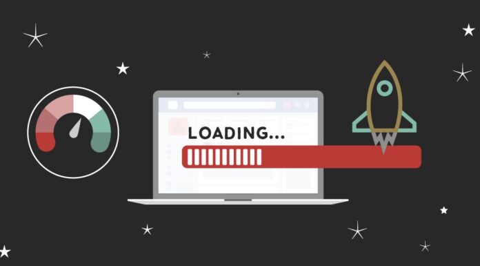
A slow SaaS app is a dead SaaS app. Fast load times and snappy transitions lead to better UX.
Reducing Load Times
Optimize images, use lazy loading, and minimize code bloat to keep your app lightning-fast.
Feedback and User Interactions
Visual Cues
Users should always know what just happened. Use color changes, animations, or toast messages to confirm actions.
Success/Failure Messages
Don’t leave users guessing. Provide clear, friendly feedback when things go right—or wrong.
Microinteractions
Button Animations
A simple hover effect or button bounce can make the experience more engaging and polished.
Hover Effects
Provide contextual hints or show hidden actions using subtle hover states.
Loading Indicators
Spinners and progress bars help manage user expectations during wait times.
A/B Testing and User Feedback Loops
Testing UI Changes
Always test before making major UX overhauls. A/B testing shows what really works based on real data.
Collecting User Feedback
Use in-app surveys, NPS scores, or feedback buttons to hear from users and improve continuously.
Real-Time Collaboration Features
UI/UX for Shared Workspaces
Enable seamless teamwork with real-time edits, comments, and mentions—all within the app.
Version Control UX
Make it easy to track changes, revert updates, and see edit histories for smoother collaboration.
Personalization and Smart Defaults
Remembering User Preferences
Save settings like themes, layouts, and last opened sections to personalize the experience.
Adaptive Interfaces
Use machine learning or logic to adapt content and layout based on user behavior.
Data Visualization and Dashboards
Simplifying Complex Data
Use charts, tables, and color coding to make data digestible—even for non-technical users.
Interactive Charts and Filters
Let users explore and filter data dynamically for deeper insights.
Security and Trust Signals in UI
Login UX
Make sign-in processes secure but user-friendly with options like SSO or magic links.
Privacy Indicators and Trust Marks
Display badges, SSL icons, and privacy statements to build user confidence.
Measuring UX Success Metrics
Time-on-Task
Track how long users take to complete common tasks. Shorter times usually mean better UX.
Conversion Rates
Are users signing up, subscribing, or completing key flows? If not, your design may need tweaking.
Churn Rate
A poor UX can drive users away. Monitor churn and correlate it with product usage data.
Conclusion
Great UI/UX design in SaaS products isn’t just about looking good—it’s about working smart. By implementing user-centered practices, simplifying interfaces, and continuously iterating based on feedback, your SaaS product can stand out in an increasingly crowded market.
FAQs
1. What is the most important UI/UX practice for SaaS products?
Focusing on user-centered design and simplicity ensures the product aligns with user expectations and reduces churn.
2. How does responsive design impact SaaS success?
It allows users to seamlessly interact across devices, improving engagement and accessibility.
3. What tools help with SaaS UX testing?
Tools like Hotjar, Google Optimize, and FullStory offer session recording, A/B testing, and heatmaps to test UI effectiveness.
4. How can I make onboarding smoother in my SaaS app?
Use tooltips, product tours, and welcome checklists to guide users through your app’s value proposition quickly.
5. Why is accessibility crucial for SaaS apps?
Inclusive design not only meets legal standards but also expands your potential user base by making the app usable for all.