


Understanding the Role of Forms in UX
Forms are more than just functional elements—they’re gateways for user interaction. Whether signing up for a newsletter, making a purchase, or submitting a contact request, forms are often the final step in a user journey. A well-designed form can encourage completion, while a poor one can frustrate users and drive them away.
The user experience (UX) of forms directly influences bounce rates, conversions, and customer satisfaction. That’s why designing effective forms for better user experience is essential for any website or app aiming for high engagement and performance.
Key Principles of Effective Form Design
Effective form design follows several guiding principles:
- Clarity: Every form element must be clearly labeled, with intuitive instructions where necessary.
- Simplicity: Only include what’s needed. Fewer fields often mean better completion rates.
- Accessibility: Ensure all users, including those with disabilities, can navigate and complete your form easily.
The mantra “form follows function” applies here—design should always support the user’s goal with minimal friction.
Choosing the Right Form Type
Not all forms are created equal. Depending on the context, different formats may yield better results:
- Inline Forms: Best for simple tasks like newsletter signups.
- Multi-Step Forms: Useful for longer processes like job applications or registrations.
- Modal Forms: Good for quick, focused interactions without navigating away from a page.
- Standalone Pages: Suitable for comprehensive forms that require user attention.
Choosing the right type depends on how much data you need and the user’s motivation level.
Optimizing Form Layout and Structure
A clean layout helps guide users through the form:
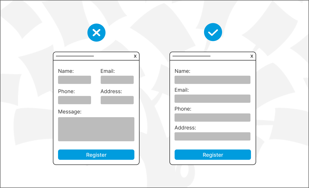
- Single-column layouts are preferred for mobile and desktop, reducing confusion.
- Group related fields together with visual spacing or fieldsets.
- Avoid clutter and ensure each field has adequate breathing room.
This organization keeps users from feeling overwhelmed and increases their likelihood of finishing the form.
Label Placement and Field Instructions
The placement of form labels significantly affects usability:
- Top-aligned labels are usually easier to scan, especially on mobile devices.
- Inline labels save space but may disappear when users start typing, causing confusion.
- Helper text or tooltips can clarify field requirements without adding visual clutter.
Every instruction should be concise and assist users at the right time.
Minimizing Input Fields
Each additional field can increase abandonment rates. To keep users engaged:
- Only ask for essential information.
- Use progressive disclosure to show more fields as needed.
- Avoid redundancy—don’t ask for the same information twice.
The shorter the form, the higher the chance users will complete it.
Enhancing Visual Hierarchy
Good visual hierarchy guides users naturally:
- Use font size, weight, and color to highlight key elements.
- Whitespace makes forms feel less overwhelming.
- Include progress indicators for long or multi-step forms to keep users informed.
Design elements should work together to create a smooth, logical flow.
Improving Mobile Form Usability
Mobile form design requires special care:
- Implement a mobile-first approach with responsive layouts.
- Ensure buttons and inputs are large enough for touch.
- Trigger the appropriate keyboard types (e.g., numeric for phone numbers).
Make it as easy as possible for users to complete forms on the go.
Accessibility Best Practices
Accessibility isn’t just a bonus—it’s a must:
- Use sufficient color contrast and avoid relying on color alone.
- Ensure compatibility with screen readers.
- Set logical tab orders and keyboard navigation paths.
Inaccessible forms alienate users and can even lead to legal issues.
Using Smart Defaults and Autocomplete
Speed up form completion with smart inputs:
- Use autocomplete attributes so browsers can suggest data.
- Provide default selections when possible (like country or gender).
- Pre-fill known information for returning users.
These features reduce friction and increase conversion.
Error Handling and Validation Feedback
Form errors are a major drop-off point. To handle them well:
- Use real-time validation to catch errors early.
- Display clear, specific error messages next to the relevant field.
- Use color and icons to indicate error or success states.
Always make it easy for users to correct mistakes.
Security and Privacy in Form Design
Building trust is key when asking for personal data:
- Use HTTPS to encrypt form submissions.
- Add trust badges or privacy policy links.
- Avoid asking for unnecessary sensitive information.
Let users know their data is safe with you.
A/B Testing for Form Optimization
Testing different form designs can uncover what works best:
- Change one element at a time—like button color, number of fields, or layout.
- Measure performance metrics like completion rate and time on form.
- Use findings to refine and iterate.
Data-backed design decisions drive better results.
Case Studies of Great Form Design
Examples speak louder than theory:
- Typeform uses engaging, one-question-at-a-time forms.
- Airbnb simplifies booking with intuitive, conversational forms.
- Dropbox keeps sign-up minimal, asking for only the essentials.
Each success story proves the power of good UX in form design.
Tools and Resources for Designing Better Forms
Here are some helpful tools:
| Tool | Use Case |
|---|---|
| Typeform | Conversational forms |
| Google Forms | Surveys and data collection |
| Wufoo | Custom form building |
| Hotjar | Form analytics and behavior tracking |
| WCAG Guidelines | Accessibility best practices |
Using the right tools saves time and improves quality.
Conclusion
Designing effective forms for better user experience isn’t just about looks—it’s about understanding user behavior and removing barriers to action. By applying principles of clarity, simplicity, and accessibility, you create forms that users enjoy interacting with. Remember, even small tweaks can lead to big results in user satisfaction and conversion rates.
Frequently Asked Questions (FAQs)
1. Why is form UX important for conversions?
A smooth form experience reduces drop-offs and helps users complete actions, improving overall conversion rates.
2. How many fields should a good form have?
As few as possible. Remove non-essential fields and stick to the data you truly need.
3. What’s the best way to show error messages?
Inline error messages near the field, using clear language and visual cues like red borders or icons.
4. How do I design forms for mobile users?
Use responsive layouts, optimize touch targets, and trigger context-appropriate keyboards.
5. Are multi-step forms better than long single-page forms?
Often, yes. Multi-step forms break up information, making the process feel less daunting and more manageable.