


Introduction
Neumorphism is an emerging design trend that blends skeuomorphism and flat design to create a soft, realistic interface. It has gained traction in UI/UX design due to its minimal yet interactive aesthetic. This article explores the principles, advantages, challenges, and implementation of neumorphism in digital design.
Table of Contents
- What is Neumorphism?
- History and Evolution of Neumorphism
- Key Characteristics of Neumorphic Design
- Neumorphism vs. Skeuomorphism vs. Flat Design
- Pros and Cons of Neumorphism in UI/UX
- How to Implement Neumorphism in UI Design
- Best Tools for Creating Neumorphic UI
- Accessibility Concerns in Neumorphism
- Neumorphism in Mobile vs. Web Design
- Color and Shadow Techniques in Neumorphic UI
- Typography and Icons in Neumorphic Design
- Best Practices for Neumorphism in UI/UX
- Common Mistakes to Avoid in Neumorphic Design
- Future of Neumorphism in UI/UX
- Examples of Neumorphism in Modern UI/UX
1. What is Neumorphism?
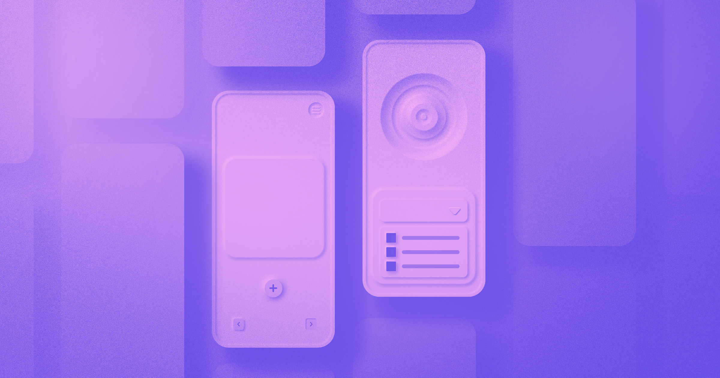
Neumorphism (New Skeuomorphism) is a UI design trend that gives elements a soft, embossed look, making them appear as if they are part of the background.
Key Features:
- Soft shadows create depth and realism.
- Monochromatic color schemes enhance aesthetics.
- Subtle gradients add dimension.
It mimics real-world interactions while maintaining a modern, minimalist appeal.
2. History and Evolution of Neumorphism
Neumorphism evolved from skeuomorphism, which aimed to replicate real-world objects in digital interfaces. While skeuomorphism faded with the rise of flat design, neumorphism emerged as a middle ground, combining depth with simplicity.
Timeline of UI Design Trends:
- Early 2000s: Skeuomorphism dominated UI design.
- 2013–2014: Flat design became the standard (Apple, Google).
- 2020 Onwards: Neumorphism gained popularity in Dribbble and Behance communities.
3. Key Characteristics of Neumorphic Design
- Soft UI elements: Raised or pressed appearance using shadows.
- Minimal contrast: Uses similar shades for background and elements.
- Subtle lighting effects: Light and dark shadows enhance depth.
Example:
cssCopyEdit.button {
    background: #e0e0e0;
    border-radius: 10px;
    box-shadow: 5px 5px 15px #bebebe, -5px -5px 15px #ffffff;
}
4. Neumorphism vs. Skeuomorphism vs. Flat Design
| Feature | Skeuomorphism | Flat Design | Neumorphism |
|---|---|---|---|
| Realism | High | Low | Moderate |
| Shadows | Strong | None | Soft |
| Color Scheme | Complex | Bright, Simple | Monochrome |
| Depth | High | None | Moderate |
Neumorphism balances realism with simplicity, offering a futuristic yet functional design approach.
5. Pros and Cons of Neumorphism in UI/UX
Pros:
✅ Aesthetic and modern appearance
✅ Creates an immersive user experience
✅ Soft and minimalistic design improves focus
Cons:
❌ Low contrast can reduce accessibility
❌ Hard to implement for complex interfaces
❌ Not ideal for high-contrast themes
6. How to Implement Neumorphism in UI Design
To design a neumorphic UI:
- Use soft shadows for depth.
- Choose monochromatic color palettes.
- Adjust border-radius for rounded edges.
- Incorporate light and dark shadow pairs.
Example:
cssCopyEdit.neumorphic {
    background: #ecf0f3;
    border-radius: 20px;
    box-shadow: 6px 6px 12px #b8b9be, -6px -6px 12px #ffffff;
}
7. Best Tools for Creating Neumorphic UI
- Figma – Ideal for prototyping.
- Adobe XD – Smooth neumorphic design integration.
- Neumorphism.io – CSS generator for neumorphic elements.
8. Accessibility Concerns in Neumorphism
Neumorphism’s low contrast can impact readability and usability.
Solutions:
- Increase text contrast.
- Use darker shadows for better depth.
- Provide alternative themes for better accessibility.
9. Neumorphism in Mobile vs. Web Design
Neumorphism is more effective in mobile UI due to:
- Smaller screen areas reducing the need for strong contrast.
- Better touch-based interactions.
For web UI, it’s less practical due to potential usability issues.
10. Color and Shadow Techniques in Neumorphic UI
Best Practices:
🎨 Use soft, pastel colors.
🌓 Combine light and dark shadows.
📐 Maintain consistent spacing and depth.
Example CSS:
cssCopyEdit.shadow {
    box-shadow: inset 4px 4px 8px #babecc, inset -4px -4px 8px #ffffff;
}
11. Typography and Icons in Neumorphic Design
- Use clean, sans-serif fonts (e.g., Poppins, Roboto).
- Ensure high contrast for readability.
- Icons should be subtly embossed.
12. Best Practices for Neumorphism in UI/UX
✔ Maintain usability by adjusting contrast.
✔ Use neumorphism only for key elements (buttons, cards).
✔ Combine with flat design for practicality.
13. Common Mistakes to Avoid in Neumorphic Design
🚫 Overuse of low-contrast elements.
🚫 Using too many shadows.
🚫 Ignoring accessibility concerns.
14. Future of Neumorphism in UI/UX
While neumorphism is aesthetically appealing, its low contrast and accessibility issues limit its long-term adoption. The trend may evolve with better color contrast and hybrid design approaches.
15. Examples of Neumorphism in Modern UI/UX
🔹 Spotify Concept UI
🔹 Smartwatch Interfaces
🔹 Neumorphic Calculator Apps
Conclusion
Neumorphism is a visually appealing UI trend that bridges realism and minimalism. While it adds depth and softness to interfaces, designers must consider accessibility challenges. By combining neumorphism with flat design, you can create a balanced, user-friendly UI.
FAQs
1. Is Neumorphism good for accessibility?
Neumorphism’s low contrast makes it less accessible, but modifications like darker shadows and higher contrast text can improve usability.
2. What are the best tools to create Neumorphic designs?
Figma, Adobe XD, and Neumorphism.io are excellent tools for designing neumorphic interfaces.
3. How is Neumorphism different from Skeuomorphism?
Neumorphism is softer and more modern than skeuomorphism, which heavily mimics real-world objects.
4. Can Neumorphism be used in dark mode?
Yes, but it requires adjusting shadow intensities to maintain the embossed effect.
5. Should I use Neumorphism in web design?
It’s best for small UI components like buttons and cards, but not for full web design due to accessibility issues.