

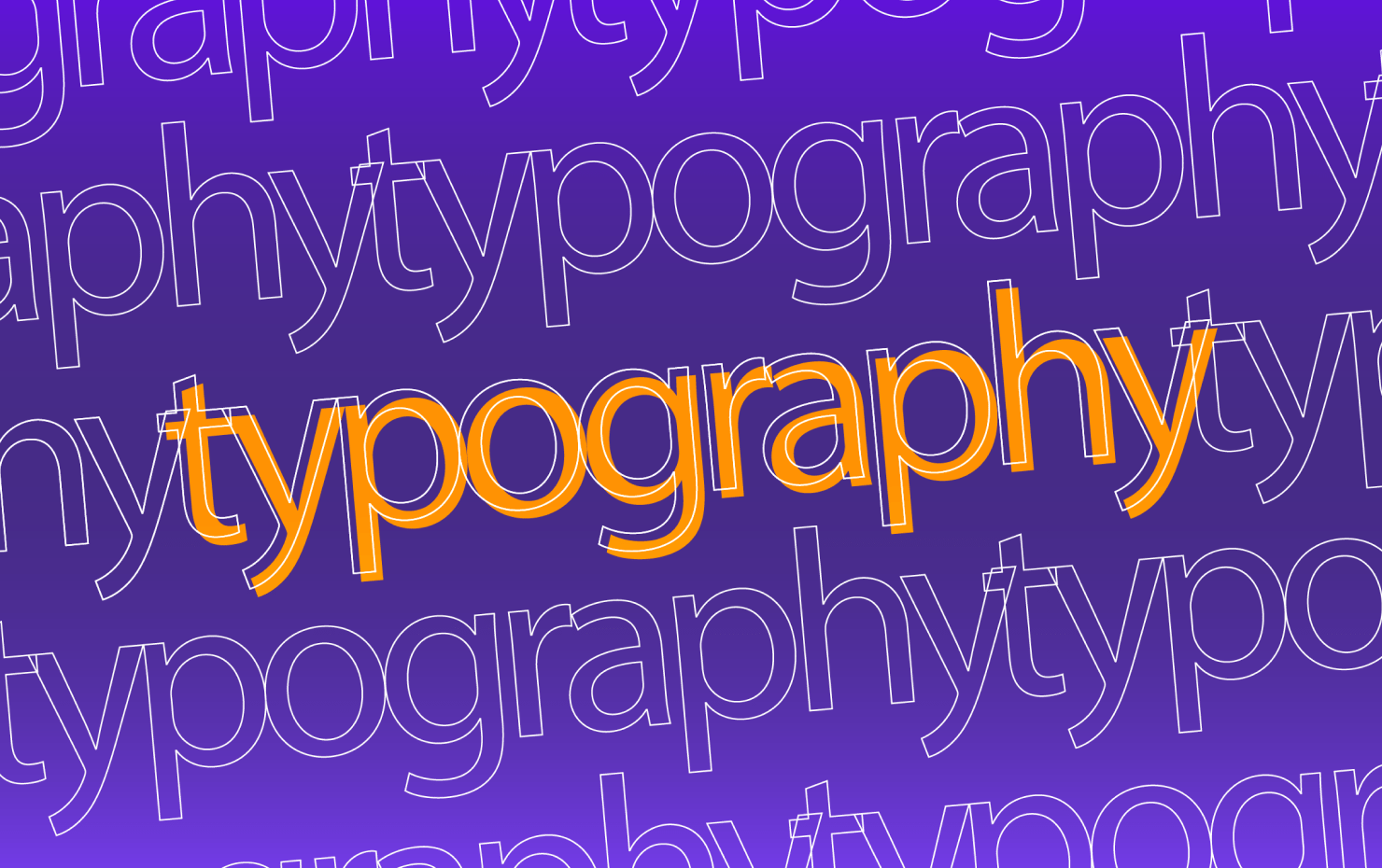
Typography plays an essential role in graphic design, influencing how a message is perceived and communicated visually. Mastering typography helps designers create engaging, readable, and aesthetically pleasing content, whether it’s for print or digital media. This article will guide you through the best practices of typography in graphic design, explore its impact, and address common questions on how to improve typographic skills.
1. Introduction to Typography
Typography refers to the art and technique of arranging type to make written language legible, readable, and visually appealing. It encompasses everything from font choice to line spacing, kerning, and the overall structure of the text. Typography has a rich history dating back to early printing techniques and has evolved into a fundamental aspect of modern design.
2. The Role of Typography in Design
In graphic design, typography is more than just letters on a page; it’s a crucial element that helps convey meaning. Good typography establishes visual hierarchy, improves readability, and enhances the overall user experience. It is used to guide the reader’s attention to key information and create a mood or emotional response.
3. Basic Elements of Typography
Understanding the basic components of typography is essential for any designer. Fonts are the specific styles within a typeface, such as Arial Bold or Times New Roman Italic. Each typeface consists of various elements, including serifs (small lines attached to the ends of letters), ascenders, descenders, and x-heights. Additionally, font weights and styles (light, bold, italic) influence the tone and emphasis of the text.
4. Typography Classifications
Typography can be broadly classified into several categories, including serif, sans-serif, script, and display typefaces. Serif typefaces, like Times New Roman, have small lines or extensions at the ends of strokes, giving them a traditional look. Sans-serif typefaces, such as Arial, are cleaner and more modern. Script fonts mimic handwriting, while display fonts are decorative and used sparingly for impact.
5. Choosing the Right Typeface
Selecting the right typeface is critical in aligning typography with the design’s purpose. Factors such as the project’s tone, audience, and medium should be considered. A playful brand might opt for a creative or whimsical typeface, while a professional, corporate identity may require a clean, modern sans-serif. Always consider the readability and the message you want to convey through your font choices.
6. Font Pairing Techniques
Combining fonts effectively can enhance your design and create a cohesive look. A common approach is to pair a serif with a sans-serif typeface, achieving a balance between contrast and harmony. When pairing fonts, avoid choosing two typefaces that are too similar or overly decorative, as this can lead to confusion and poor readability.
7. Hierarchy and Readability
Establishing a clear visual hierarchy through typography helps guide the viewer’s eye across the design in a logical order. Use font sizes, weights, and colors to differentiate headings from body text and emphasize important content. Proper kerning, tracking, and leading ensure that the text is spaced evenly and remains easy to read across different platforms.
8. Color and Typography
Color can significantly impact the legibility and emotional response of typography. High contrast between text and background is essential for readability. Additionally, colors evoke emotions—reds may signal urgency, while blues evoke calmness. Ensure that your color choices align with the intended mood and that the text remains readable under all conditions.
9. Responsive Typography
In today’s digital age, designs must adapt to different screen sizes, which is where responsive typography comes into play. Using scalable fonts and ensuring text readability across devices, from desktops to mobile phones, is vital. Techniques such as fluid typography, where font size adjusts based on screen width, ensure consistent user experiences across platforms.
10. Accessibility in Typography
Typography must be accessible to all users, including those with visual impairments. Designers should use sufficient contrast between text and background, choose easily readable fonts, and avoid overly decorative styles. Compliance with web accessibility standards is necessary to ensure inclusivity, particularly for users with disabilities who rely on screen readers or high-contrast settings.
11. Custom Typography
Custom typefaces are increasingly used to create unique, recognizable brand identities. Companies often invest in bespoke fonts to stand out from competitors and reinforce their branding across various platforms. Custom fonts offer flexibility and exclusivity, allowing designers to craft a typeface that reflects the brand’s personality perfectly.
12. Typography in Branding
Typography plays a pivotal role in building brand recognition. It helps to create consistency across marketing materials, websites, and packaging. When chosen correctly, typography can evoke certain emotions and values, becoming synonymous with the brand itself. Brands like Coca-Cola, with its distinctive script font, demonstrate the power of typography in creating an iconic identity.
13. Typography in Print vs. Web
Typography behaves differently in print and digital media. Print typography prioritizes the sharpness and quality of the type on paper, with an emphasis on traditional typefaces like serif fonts. On the web, fonts are chosen for their clarity on screens, leading to the rise of sans-serif typefaces in web design due to their readability and scalability.
14. Common Typography Mistakes
There are several common mistakes that designers make with typography, such as overusing decorative fonts or choosing inappropriate font pairings. Inconsistent use of fonts can create a chaotic design, while improper line spacing and kerning can harm readability. It’s essential to maintain consistency in your typographic choices to ensure a polished final product.
15. Tools for Typography
Numerous tools are available to assist designers in creating excellent typography. Platforms like Adobe Fonts and Google Fonts offer a vast selection of typefaces that can be easily integrated into digital projects. There are also typography-specific design tools that help with font pairing, spacing adjustments, and custom font creation.
16. Trends in Typography
Typography trends constantly evolve, with recent designs leaning towards minimalism, bold fonts, and retro styles. These trends reflect broader design movements and cultural shifts, but it’s essential to adopt trends in moderation. The key is to ensure that your typography remains timeless and functional, rather than relying solely on temporary fads.
17. Typography and Emotional Design
Typography has the power to evoke emotions and create connections with the audience. The choice of typeface, spacing, and color can influence how a design makes people feel. For instance, elegant serif fonts can convey sophistication, while bold sans-serifs may suggest strength or modernity. Designers must be mindful of the emotional response their typography generates.
18. Future of Typography
As technology advances, so too does typography. The future of typography is likely to include more dynamic and variable fonts, which allow for greater flexibility in how text appears across different platforms. Artificial intelligence is also influencing typography, enabling automatic font pairings and design suggestions based on the content’s context.
19. Best Practices in Typography
To master typography in graphic design, always prioritize legibility and readability. Maintain consistency in typeface use across different media, ensure sufficient contrast between text and background, and adjust spacing to enhance clarity. Understanding and applying these best practices will elevate your design’s professionalism and effectiveness.
Conclusion
Typography is a vital aspect of graphic design that influences how audiences perceive and interact with content. By following best practices and considering factors such as readability, hierarchy, and accessibility, designers can create visually appealing, effective typography that enhances their overall design work.
FAQs
Q1: What is the difference between a font and a typeface? A font refers to the specific style within a typeface (e.g., Arial Bold or Times New Roman Italic), while a typeface is the family of fonts that share common design features.
Q2: How can I improve the readability of my typography? Improving readability involves choosing the right font size, ensuring adequate line spacing, and maintaining high contrast between text and background. Avoid overly decorative fonts for body text and focus on clarity.
Q3: What is kerning, and why is it important? Kerning refers to the space between individual characters in a word. Proper kerning ensures that letters are evenly spaced, improving the overall appearance and readability of the text.
Q4: How many fonts should I use in a design? It’s best to limit the number of fonts in a design to two or three. Too many fonts can create a cluttered look and confuse the viewer.
Q5: What are responsive fonts? Responsive fonts adjust their size and layout based on the screen size of the device being used. This ensures that text remains legible and well-formatted across different platforms.