


Understanding Responsive Design
What is Responsive Design?
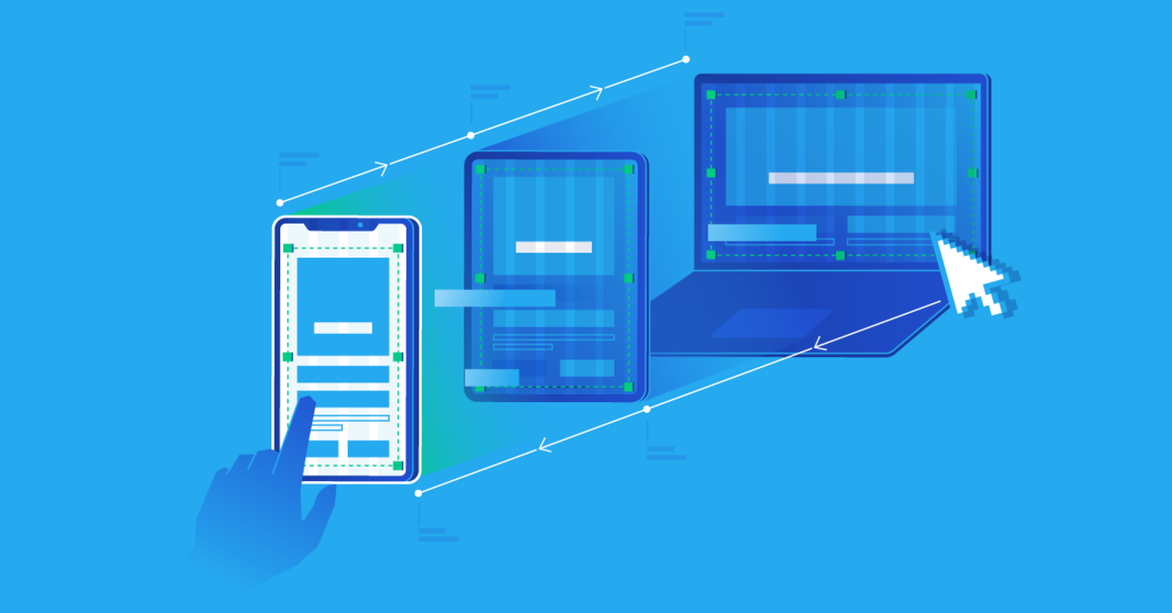
Responsive design is a web development approach that ensures websites adapt seamlessly across different screen sizes, from smartphones and tablets to laptops and large monitors. Instead of creating multiple versions of a site, responsive design uses a flexible layout that adjusts elements like text, images, and navigation automatically.
This approach relies on fluid grids, flexible images, and media queries to rearrange content based on screen dimensions. It enables a consistent and optimized user experience, regardless of the device being used.
Importance in Modern Web Development
With mobile traffic accounting for over half of global web usage, responsive design is no longer optional. Google favors mobile-friendly websites in its ranking algorithm, making responsiveness crucial for SEO. Moreover, it enhances user satisfaction, reduces bounce rates, and increases conversion potential.
Responsive design simplifies site maintenance, as changes apply across all device views. It also ensures accessibility, scalability, and future-proofing for new devices.
Key Principles of Responsive Design
Fluid Grid Systems
A fluid grid divides the screen into proportional columns instead of fixed-width units. This allows elements to scale relative to the screen size. For example, a layout may have three columns on desktop but collapse into a single column on mobile.
Flexible Images
Images in responsive design should scale within their container. Using the max-width: 100% CSS property ensures that images resize without overflowing their boundaries. SVGs and WebP formats are popular for their scalability and performance benefits.
Media Queries
Media queries are CSS rules that apply styles based on screen characteristics like width, height, orientation, and resolution. Example:
cssCopyEdit@media (max-width: 768px) {
  body {
    font-size: 16px;
  }
}
They allow developers to fine-tune layouts and typography for various devices.
Mobile-First vs Desktop-First Approach
Pros and Cons of Mobile-First
A mobile-first strategy involves designing for the smallest screen first, then enhancing the layout for larger devices. It ensures that core content loads fast and remains accessible on mobile. However, complex desktop features may require significant overrides.
When to Use Desktop-First
Desktop-first design starts with larger screens and scales down. It’s useful for applications primarily accessed via desktop. However, it risks ignoring mobile usability if not properly adapted.
Designing for Multiple Screen Sizes
Common Screen Resolutions
Understanding standard screen sizes helps define breakpoints:
- Mobile: 360×640
- Tablet: 768×1024
- Laptop: 1366×768
- Desktop: 1920×1080
Breakpoints in CSS
Breakpoints mark the points where the layout needs adjustment. Common examples:
@media (max-width: 600px)@media (min-width: 601px) and (max-width: 1024px)
Touchscreen vs Pointer Navigation
Responsive sites should accommodate both touchscreen and pointer interactions. Touch targets (like buttons) should be at least 48px for ease of use on mobile.
Tools and Frameworks for Responsive Design
Bootstrap and Foundation
Two of the most popular responsive design frameworks are Bootstrap and Foundation. Both offer a comprehensive grid system, pre-designed components, and responsive utilities.
- Bootstrap is widely used due to its extensive documentation and community support. Its mobile-first grid system uses containers, rows, and columns to adapt layouts effortlessly.
- Foundation by Zurb is another robust framework known for its flexibility and accessibility features. It’s ideal for complex and large-scale projects.
These frameworks accelerate development, reduce the need for custom code, and ensure consistency across devices.
CSS Grid and Flexbox
Modern CSS provides powerful layout tools:
- Flexbox is best for one-dimensional layouts (either row or column). It’s ideal for aligning items and distributing space within a container.
- CSS Grid is perfect for two-dimensional layouts, allowing for precise control over rows and columns.
Both are natively supported in all major browsers and offer superior control compared to older layout techniques like floats or tables.
Browser Developer Tools
Every modern browser includes built-in developer tools for testing responsiveness:
- Chrome DevTools lets you simulate different screen sizes and inspect layout changes in real-time.
- Firefox Developer Edition offers a responsive design mode for more detailed emulation.
These tools help spot layout issues and tweak CSS directly in the browser.
Performance Considerations
Optimizing Images and Fonts
Performance is key for mobile users with limited bandwidth. Use the following techniques:
- Responsive images with
srcsetattributes to serve appropriately sized images. - WebP or AVIF formats for smaller file sizes.
- Google Fonts or local fonts with fallbacks for faster loading.
Lazy Loading Techniques
Lazy loading delays the loading of images or videos until they are visible on the screen. This improves initial load times and user experience.
Use the native loading="lazy" attribute or JavaScript libraries like Lozad.js for this purpose.
Testing Your Responsive Design
Cross-Device Testing
Testing on various devices is crucial. Use:
- BrowserStack or Sauce Labs for real-device testing.
- Responsive Design Checker tools to view sites on different screen sizes.
Emulators vs Real Devices
While emulators offer convenience, real devices provide more accurate feedback on performance, touch interactions, and rendering.
Accessibility in Responsive Design
Scalable Fonts and Buttons
Ensure text and interactive elements scale well. Use:
- Relative units like
emorreminstead ofpx - Large, tappable buttons for mobile users
ARIA Landmarks and Semantics
ARIA roles and proper HTML5 semantic tags (like <header>, <nav>, <main>, <footer>) improve accessibility and screen reader compatibility, ensuring your responsive design is inclusive.
Best Practices for Responsive Web Design
Consistent Navigation
Use a navigation system that adapts:
- Hamburger menus for small screens
- Mega menus or visible nav bars on desktop
Prioritizing Content
Responsive design is not just about resizing. It’s also about rethinking content hierarchy. Highlight key messages and CTAs first.
Avoiding Horizontal Scrolling
Nothing breaks a responsive experience faster than horizontal scroll on mobile. Use fluid containers and test thoroughly to prevent this issue.
Common Responsive Design Mistakes to Avoid
Fixed Width Layouts
Hardcoding pixel widths breaks layouts on smaller screens. Always prefer percentage-based widths or use a grid system.
Overuse of Media Queries
While media queries are essential, over-relying on them can complicate maintenance. Instead, use flexible designs that adapt naturally.
Real-World Examples of Great Responsive Design
eCommerce Sites
Sites like Amazon and Etsy provide seamless experiences across devices. They use clear product images, intuitive navigation, and fast load times.
News Websites
BBC and The New York Times optimize reading experiences with adjustable typography, fluid layouts, and efficient content stacking.
Future Trends in Responsive Design
Responsive Typography
Variable fonts and CSS functions like clamp() allow fonts to adjust dynamically between screen sizes without breakpoints.
cssCopyEditfont-size: clamp(1rem, 2.5vw, 2rem);
Container Queries
Unlike media queries that depend on the viewport, container queries allow components to adapt based on their container size. This modular approach is gaining support in modern browsers.
Responsive Design for Web Apps
Handling Interactivity
Web apps must adapt both layout and functionality. Use progressive enhancement—start with a basic version and add features for capable devices.
Offline-First Design
For reliability, especially in mobile contexts, use Service Workers to cache assets and enable offline access to key features.
SEO Benefits of Responsive Design
Google’s Mobile-First Index
Google indexes the mobile version of your site first. A responsive design ensures your content is accessible and ranks well on search engines.
Reduced Bounce Rates
A responsive, fast-loading, and user-friendly site keeps visitors engaged, lowering bounce rates and improving dwell time—two critical SEO signals.
Conclusion
Final Thoughts on Implementing Responsive Design
Creating a responsive design is about more than just resizing elements. It’s about delivering a consistent, enjoyable experience on any device. By embracing fluid layouts, optimizing performance, and testing thoroughly, you ensure your website is future-ready, accessible, and search engine-friendly.
FAQs
1. What is the difference between adaptive and responsive design?
Responsive design uses flexible layouts that adjust dynamically, while adaptive design uses predefined layouts for specific screen sizes.
2. How many breakpoints should I use?
Use as few breakpoints as necessary. Typically, 3–5 breakpoints for mobile, tablet, and desktop are enough, depending on your audience.
3. Does responsive design improve SEO?
Yes. Google prioritizes mobile-friendly websites, and responsive designs load faster and provide better UX, boosting SEO performance.
4. Can I use media queries in JavaScript?
Absolutely. Use the window.matchMedia() API to detect screen size changes and apply logic accordingly.
javascriptCopyEditif (window.matchMedia("(max-width: 600px)").matches) {
  // Do something for small screens
}
5. What tools can help with responsive testing?
Tools like Chrome DevTools, BrowserStack, Responsively App, and Responsive Design Checker allow you to preview and debug across devices.