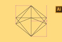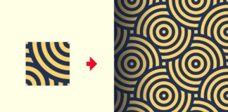


Icons play a crucial role in modern design, whether for websites, apps, or branding materials. Adobe Illustrator is the industry standard for creating high-quality vector icons that are scalable and versatile. In this guide, you’ll learn step-by-step how to create stunning icons in Adobe Illustrator, along with essential tips and techniques to refine your design.
Why Use Adobe Illustrator for Icon Design?
Adobe Illustrator offers powerful vector-based tools that allow for precision, scalability, and flexibility when creating icons. Unlike raster images, vector icons can be resized without losing quality, making them ideal for UI/UX design, web graphics, and mobile applications.
Benefits of Using Adobe Illustrator for Icons
✅ Scalability – Icons remain sharp at any size.
✅ Precision – Pen tool and shape tools allow accurate control.
✅ Reusable Components – Symbols and assets can be reused across projects.
✅ Export Options – Supports multiple formats like SVG, PNG, and EPS.
Step-by-Step Guide to Creating Icons in Adobe Illustrator
Step 1: Set Up Your Artboard
Before you start designing, it’s important to set up your artboard properly.
- Open Adobe Illustrator and create a new document.
- Set the artboard size (64x64px or 128x128px are common sizes).
- Choose the RGB color mode for digital icons.
- Enable Pixel Preview (View > Pixel Preview) to see how the icon appears at smaller sizes.
Step 2: Create a Basic Shape
Icons are often based on simple geometric shapes.
- Use the Ellipse Tool (L) or Rectangle Tool (M) to start your design.
- Hold Shift while drawing to maintain perfect proportions.
- Combine shapes using the Pathfinder Panel (Window > Pathfinder).
Step 3: Refine with the Pen and Shape Builder Tools
For custom designs, use these powerful tools:
- The Pen Tool (P) allows you to create precise curves and custom shapes.
- The Shape Builder Tool (Shift + M) lets you combine or subtract shapes easily.
Step 4: Add Stroke and Fill Colors
Make your icons visually appealing by using colors and strokes.
- Use Fill Color to add solid colors to the icon.
- Adjust the Stroke Weight (1-2px for web icons) for clean outlines.
- Experiment with gradients and shadows to add depth.
Step 5: Convert to Outlines for Scalability
To ensure your icon is scalable and clean:
- Select the shape and go to Object > Expand Appearance.
- This converts strokes into solid vector paths.
Step 6: Optimize for Export
Once your icon is ready, follow these steps to export it:
- Go to File > Export > Export As.
- Choose SVG, PNG, or EPS based on your needs.
- If exporting for the web, select “Use Artboards” to keep alignment.
Pro Tips for Creating Stunning Icons
🎨 Keep It Simple – Avoid unnecessary details that may not be visible at smaller sizes.
📏 Work in a Grid – Use a pixel grid for alignment and consistency.
🔁 Use Symbols – Convert reusable elements into symbols for efficiency.
🎯 Maintain Consistency – Use a consistent stroke weight and color palette across all icons.
🖼 Test at Different Sizes – Ensure clarity at 16x16px, 32x32px, and larger sizes.
FAQs
1. What is the best size for icons?
Standard icon sizes include 16x16px, 32x32px, 64x64px, and 128x128px. For web and app design, SVG format is preferred for scalability.
2. How can I create pixel-perfect icons?
Enable Pixel Preview (View > Pixel Preview) and snap objects to the pixel grid to ensure sharp, clean edges.
3. What format should I export my icons in?
For web use, export as SVG or PNG. For print, use EPS or PDF.
4. How do I make my icons look professional?
Use a consistent stroke weight, simple shapes, and a limited color palette. Avoid excessive details.
5. Can I use Illustrator to create animated icons?
Yes! You can design icons in Illustrator and animate them in Adobe After Effects using the Overlord plugin.